MATH167R: Data visualization
Warm-up
What does the following code do?
Warm-up
library(palmerpenguins)
library(tidyverse)
data(penguins)
penguins |>
  group_by(species, island) |>
summarize(mean_body_mass = mean(body_mass_g, na.rm = T))# A tibble: 5 × 3
# Groups: species [3]
species island mean_body_mass
<fct> <fct> <dbl>
1 Adelie Biscoe 3710.
2 Adelie Dream 3688.
3 Adelie Torgersen 3706.
4 Chinstrap Dream 3733.
5 Gentoo Biscoe 5076.Overview of today
- Data visualization in base R
- Data visualization with
ggplot2 - Principles of data visualization
Data visualization
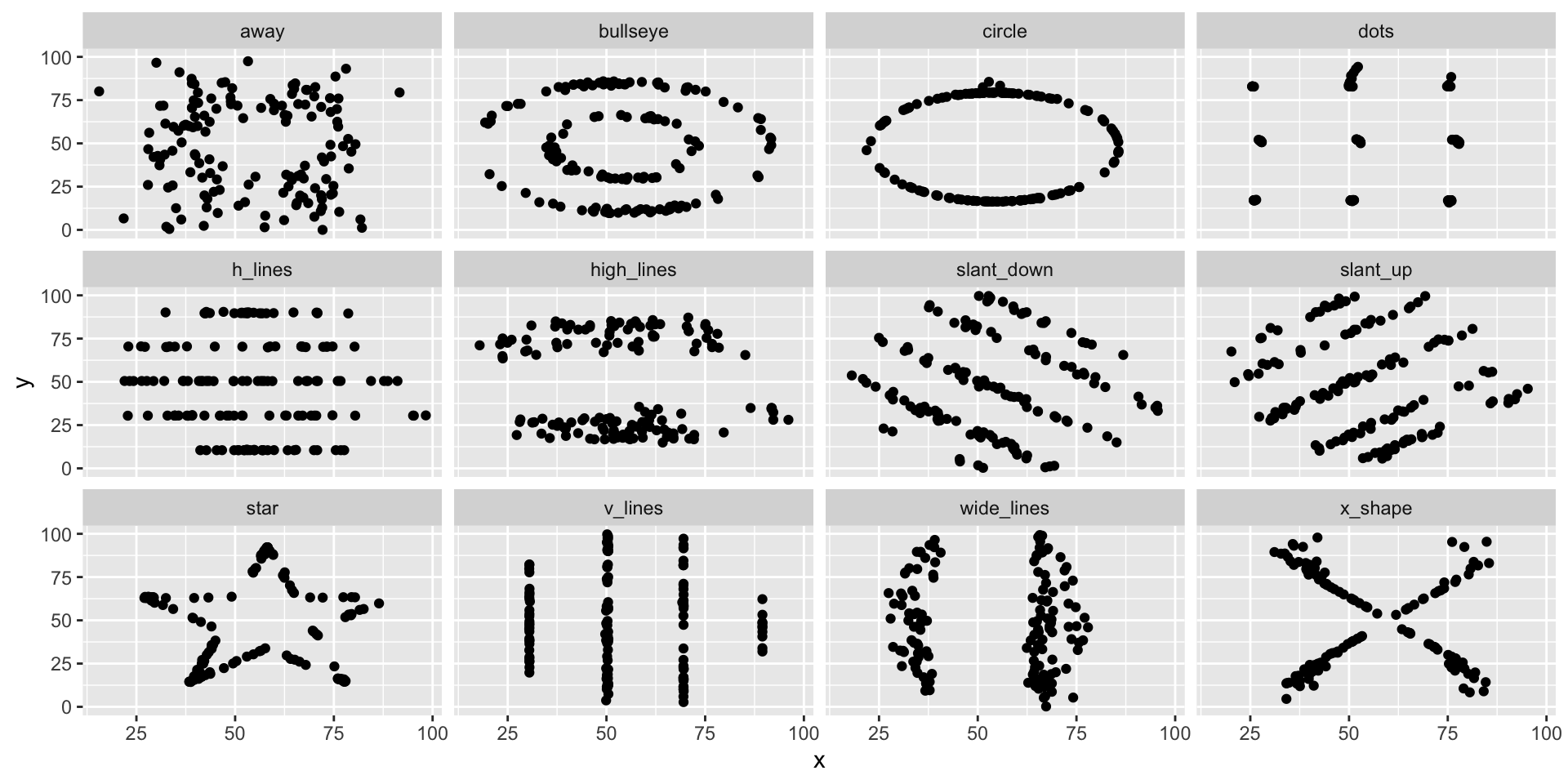
Why look at data?
Why look at data?
All of these datasets have the same means for x and y, and (approximately) the same correlation:
# A tibble: 13 × 4
   dataset    mean_x mean_y correlation
   <chr>       <dbl>  <dbl>       <dbl>
 1 away         54.3   47.8        -0.1
 2 bullseye     54.3   47.8        -0.1
 3 circle       54.3   47.8        -0.1
 4 dino         54.3   47.8        -0.1
 5 dots         54.3   47.8        -0.1
 6 h_lines      54.3   47.8        -0.1
 7 high_lines   54.3   47.8        -0.1
 8 slant_down   54.3   47.8        -0.1
 9 slant_up     54.3   47.8        -0.1
10 star         54.3   47.8        -0.1
11 v_lines      54.3   47.8        -0.1
12 wide_lines   54.3   47.8        -0.1
13 x_shape      54.3   47.8        -0.1
Why look at data?
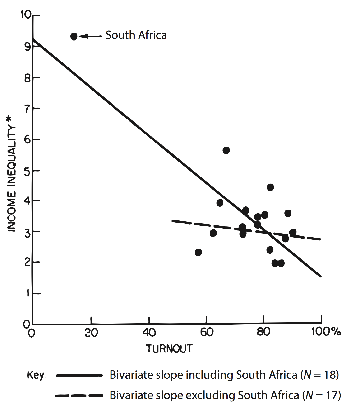
from Jackson (1980) as reproduced in Kieran Healy’s Data Visualization.
What makes a good data visualization?
- Legibility: Is it easy for the viewer to understand and interpret your visual?
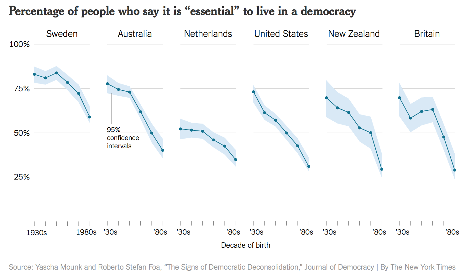
- Integrity: Does the visual accurately communicate some insight about the data?
- Beauty: Is the visual appealing and uncluttered?
Other Readings:
Legibility
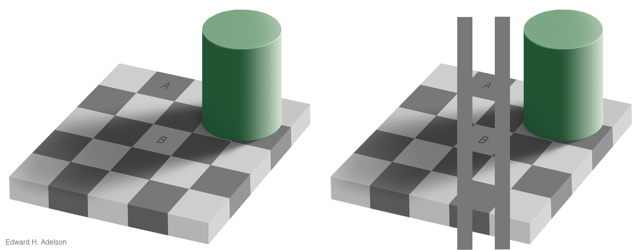
from Edward H. Adelson as reproduced in Kieran Healy’s Data Visualization.
Legibility

Legibility
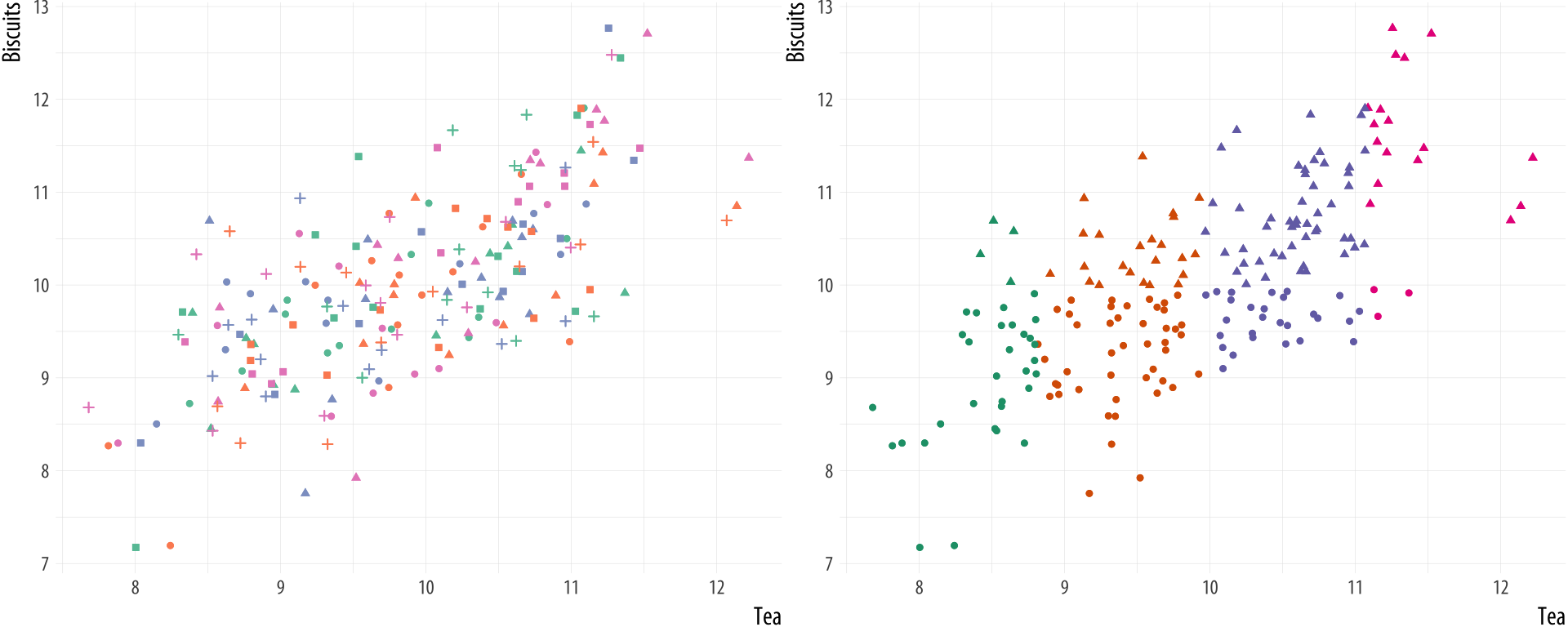
from Kieran Healy’s Data Visualization.
Integrity
Integrity
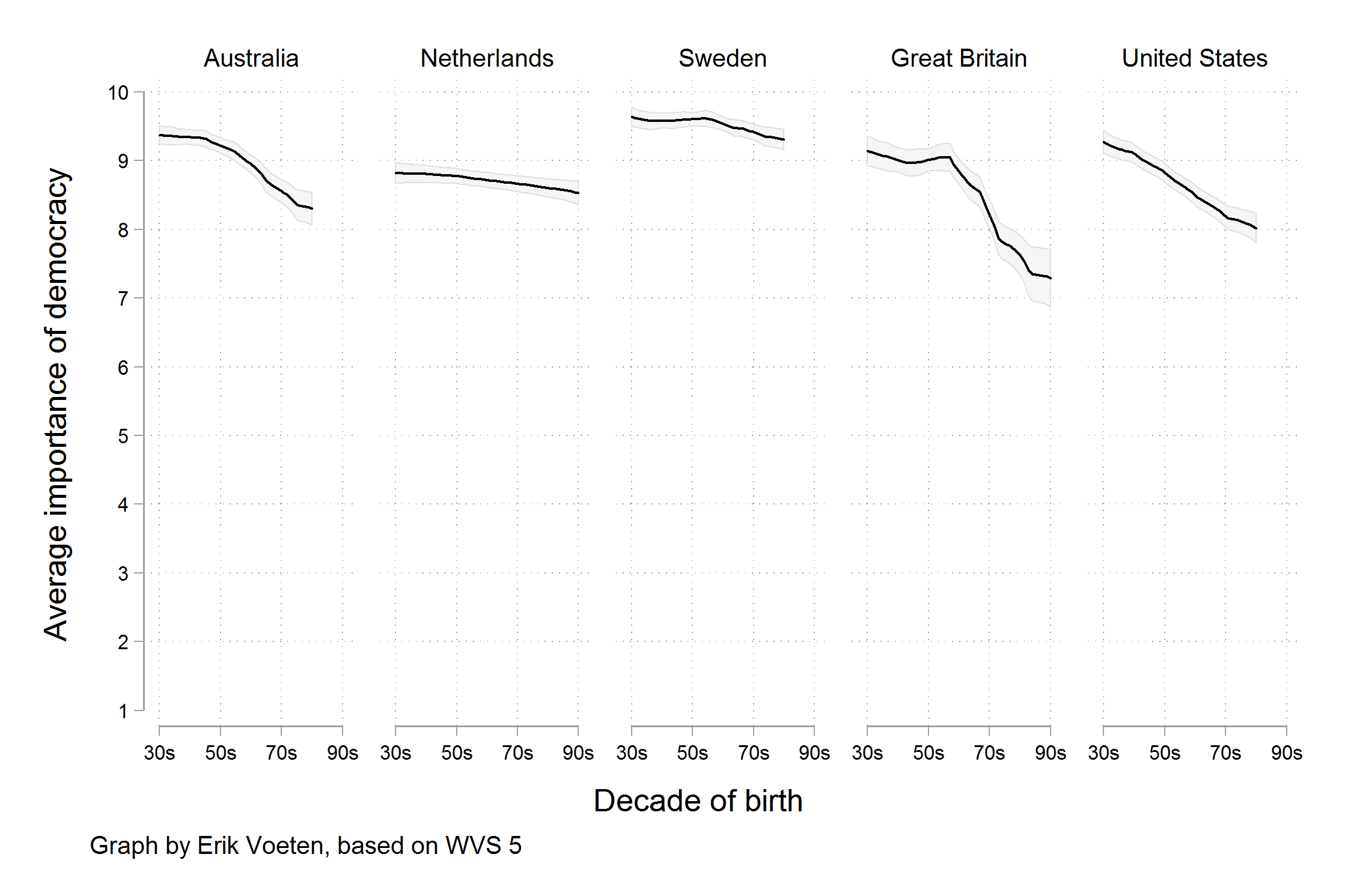
Example: Movies data
| ...1 | release_date | movie | production_budget | domestic_gross | worldwide_gross | distributor | mpaa_rating | genre |
|---|---|---|---|---|---|---|---|---|
| 1 | 6/22/2007 | Evan Almighty | 1.75e+08 | 100289690 | 174131329 | Universal | PG | Comedy |
| 2 | 7/28/1995 | Waterworld | 1.75e+08 | 88246220 | 264246220 | Universal | PG-13 | Action |
| 3 | 5/12/2017 | King Arthur: Legend of the Sword | 1.75e+08 | 39175066 | 139950708 | Warner Bros. | PG-13 | Adventure |
| 4 | 12/25/2013 | 47 Ronin | 1.75e+08 | 38362475 | 151716815 | Universal | PG-13 | Action |
| 5 | 6/22/2018 | Jurassic World: Fallen Kingdom | 1.70e+08 | 416769345 | 1304866322 | Universal | PG-13 | Action |
| 6 | 8/1/2014 | Guardians of the Galaxy | 1.70e+08 | 333172112 | 771051335 | Walt Disney | PG-13 | Action |
| 7 | 5/7/2010 | Iron Man 2 | 1.70e+08 | 312433331 | 621156389 | Paramount Pictures | PG-13 | Action |
| 8 | 4/4/2014 | Captain America: The Winter Soldier | 1.70e+08 | 259746958 | 714401889 | Walt Disney | PG-13 | Action |
| 9 | 7/11/2014 | Dawn of the Planet of the Apes | 1.70e+08 | 208545589 | 710644566 | 20th Century Fox | PG-13 | Adventure |
| 10 | 11/10/2004 | The Polar Express | 1.70e+08 | 186493587 | 310634169 | Warner Bros. | G | Adventure |
| 11 | 6/1/2012 | Snow White and the Huntsman | 1.70e+08 | 155136755 | 401021746 | Universal | PG-13 | Adventure |
| 12 | 7/1/2003 | Terminator 3: Rise of the Machines | 1.70e+08 | 150358296 | 433058296 | Warner Bros. | R | Action |
| 13 | 5/7/2004 | Van Helsing | 1.70e+08 | 120150546 | 300150546 | Universal | PG-13 | Action |
| 14 | 5/22/2015 | Tomorrowland | 1.70e+08 | 93436322 | 207283457 | Walt Disney | PG | Adventure |
| 15 | 5/27/2016 | Alice Through the Looking Glass | 1.70e+08 | 77042381 | 276934087 | Walt Disney | PG | Adventure |
| 16 | 5/21/2010 | Shrek Forever After | 1.65e+08 | 238736787 | 756244673 | Paramount Pictures | PG | Adventure |
| 17 | 11/4/2016 | Doctor Strange | 1.65e+08 | 232641920 | 676486457 | Walt Disney | PG-13 | Action |
| 18 | 11/7/2014 | Big Hero 6 | 1.65e+08 | 222527828 | 652127828 | Walt Disney | PG | Adventure |
| 19 | 3/26/2010 | How to Train Your Dragon | 1.65e+08 | 217581232 | 494870992 | Paramount Pictures | PG | Adventure |
| 20 | 11/2/2012 | Wreck-It Ralph | 1.65e+08 | 189412677 | 496511521 | Walt Disney | PG | Adventure |
Univariate visualizations
Univariate visualizations describe one variable at a time.
For categorical variables, usually bar plots or pie charts are used.
For numerical variables, usually histograms, box plots, or density plots are used.
Summarizing categorical data with a table
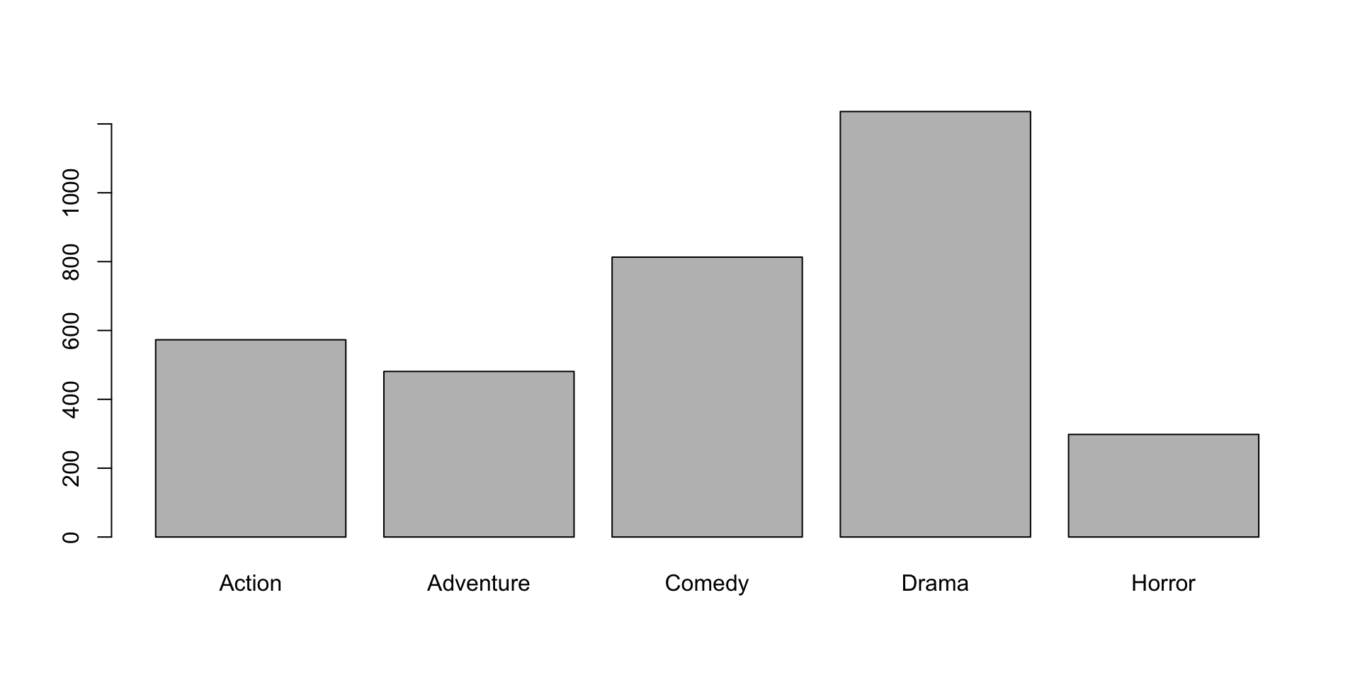
Visualizing a categorical variable
The barplot function takes a named numeric vector as its first argument:
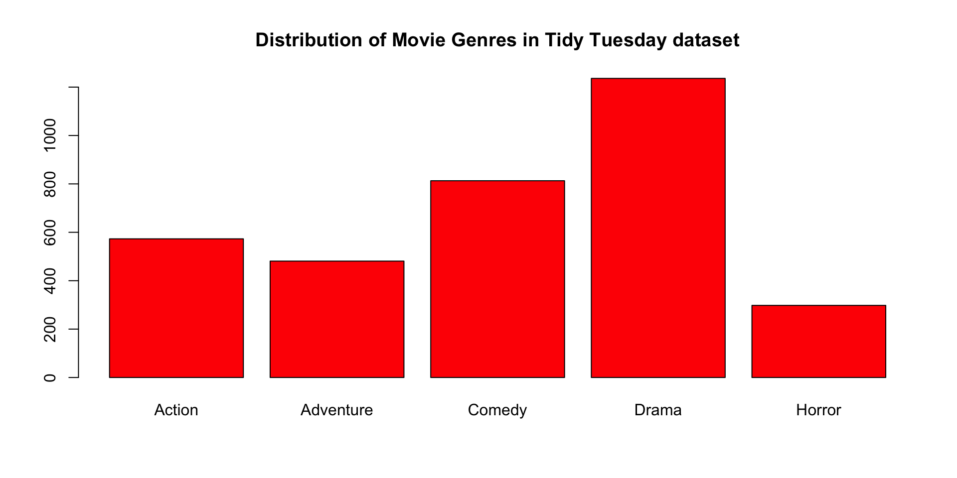
Customizing base R plots
Base R plotting functions have many optional arguments allowing customization:
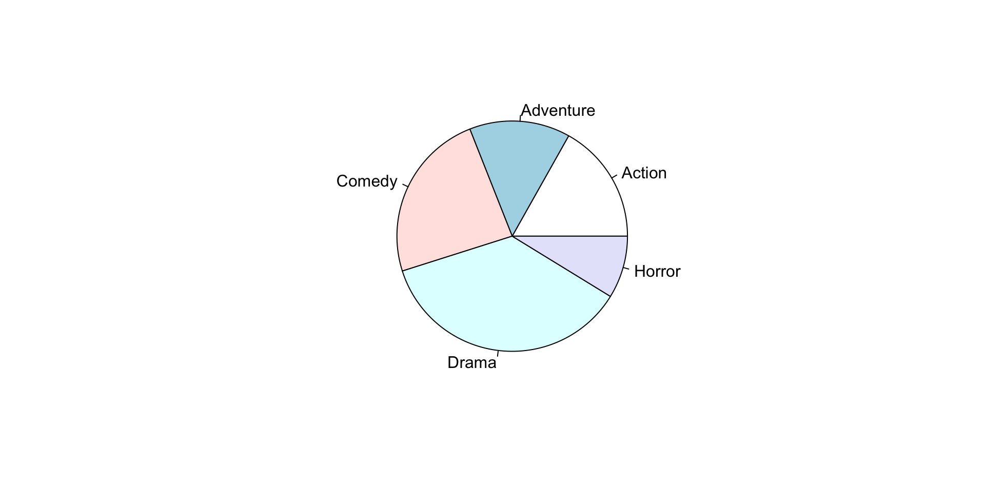
Visualizing a categorical variable
The pie function takes a named numeric vector as its first argument:
Summarizing a numerical variable
Visualizing a numerical variable
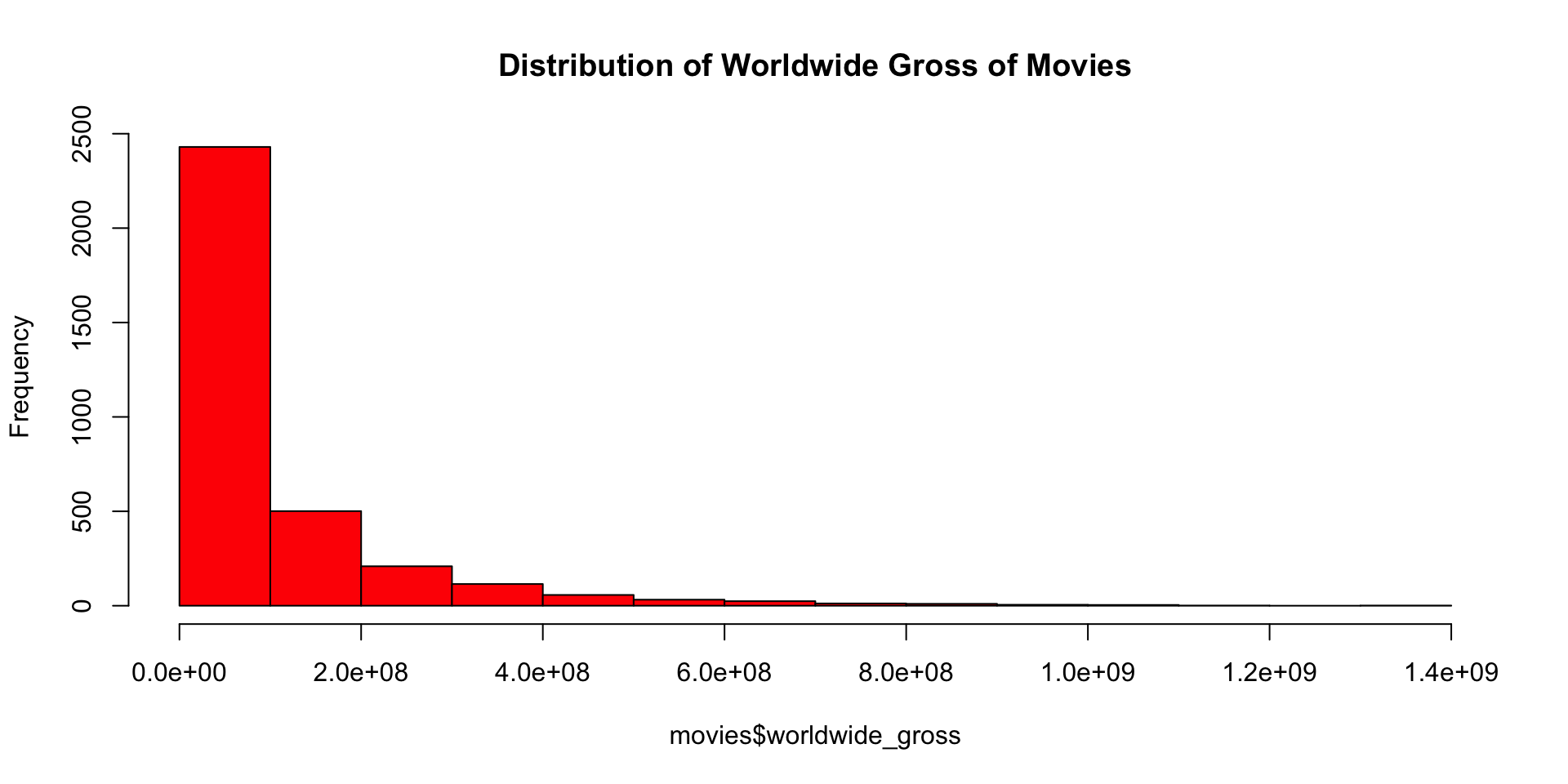
What shape does this distribution have?
Visualizing a numerical variable
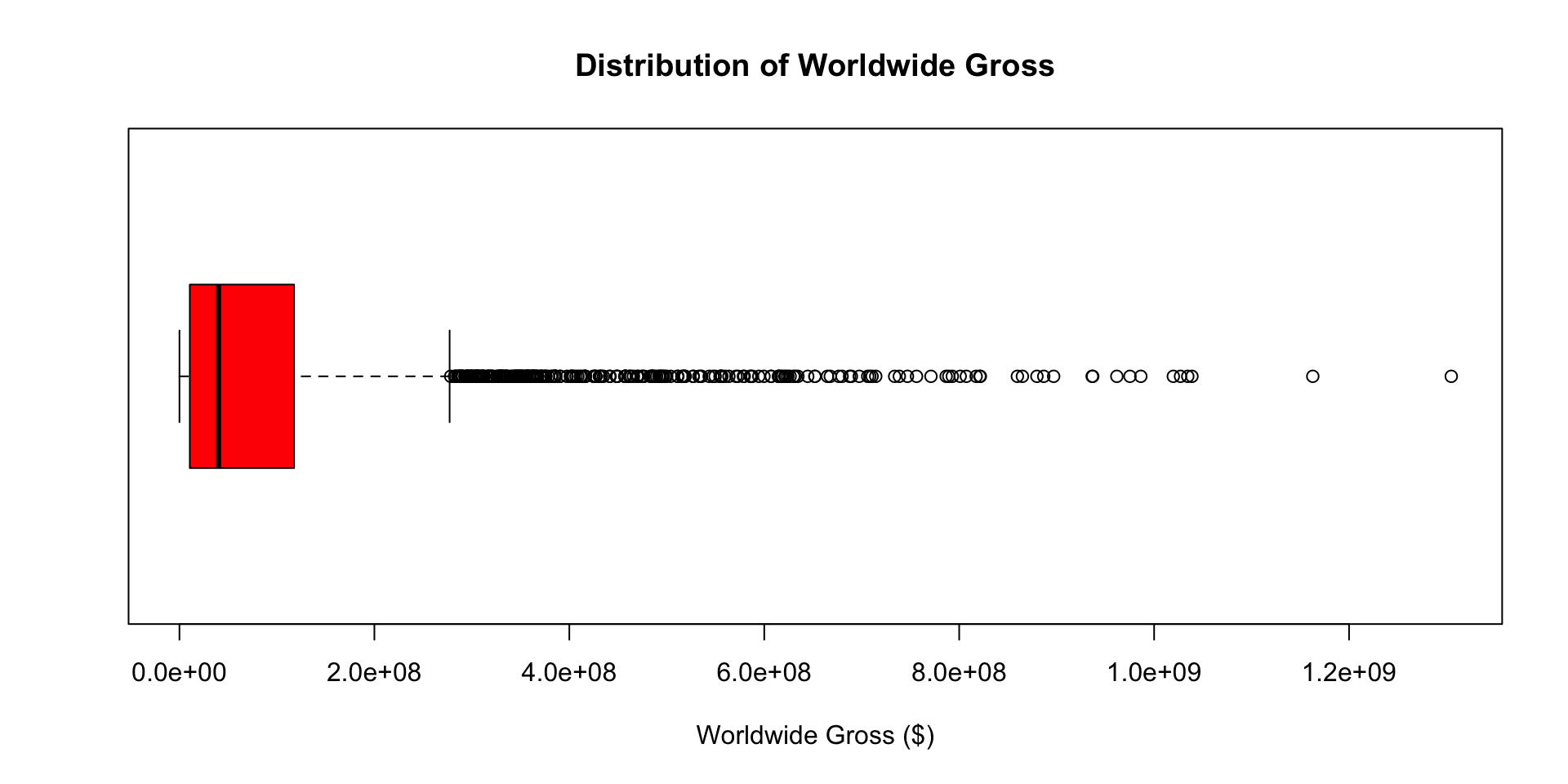
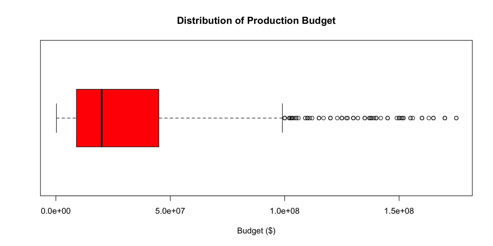
Visualizing a numerical variable
Multivariate visualizations
How might we plot the relationship between a numerical variable and a categorical variable?
How about between two categorical variables? Between two numerical variables?
What if we want to visualize three variables at once?
Visualizing two numerical variables
The plot function can be used to obtain scatter plots for two numerical variables:
Visualizing two numerical variables
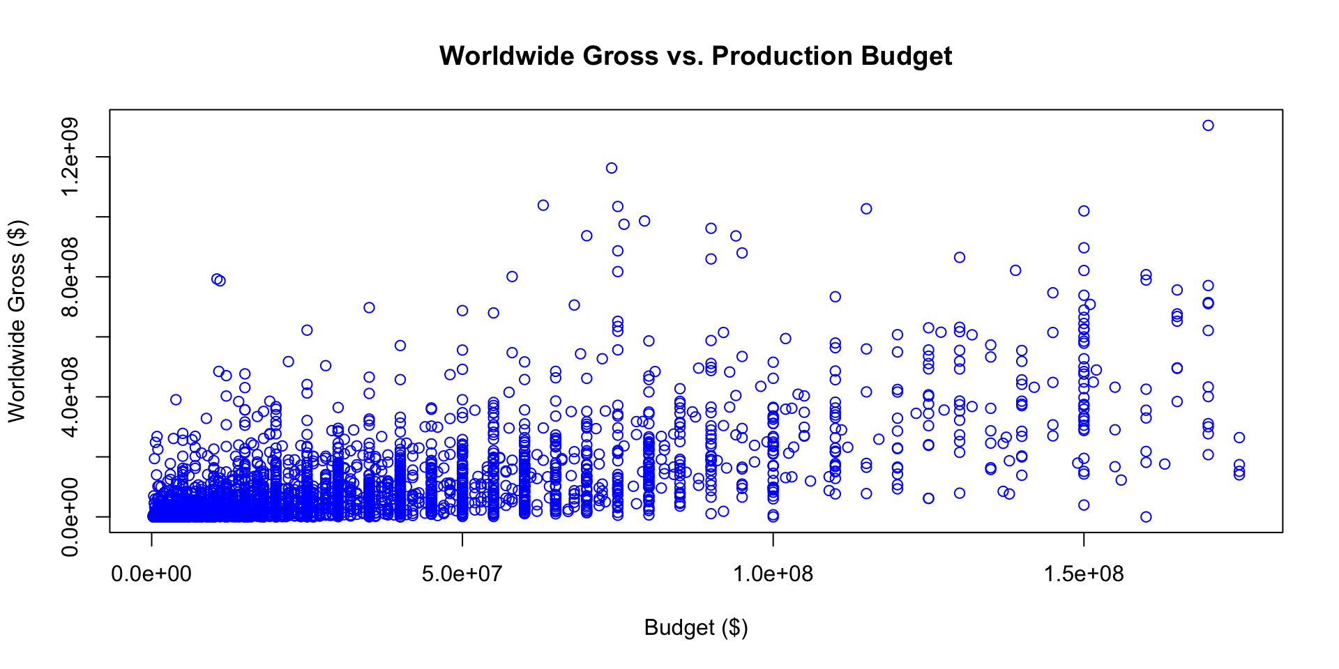
Visualizing a numerical variable and a categorical variable
The plot function can be used to obtain stacked boxplots for two numerical variables:
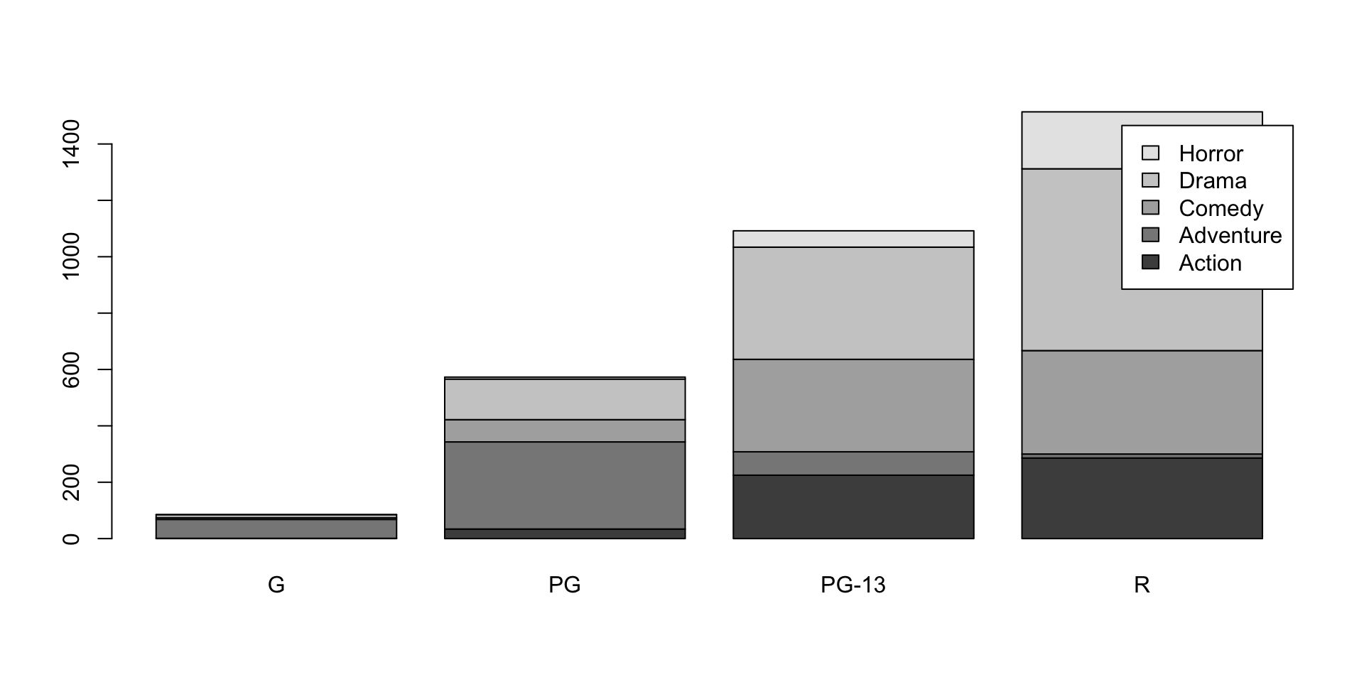
Visualizing two categorical variables
Visualizing two categorical variables
Data visualization with ggplot2
ggplot2 is a fantastic package for making complex visualizations that many people find more intuitive to use.
Plots are built sequentially using layers, so it’s easy to edit and fine-tune the plots you generate.
When using ggplot2, it is essential that your data are properly formatted If they are not, the results probably will not look like you expect.
Let’s work through how to build a plot layer by layer.
Data visualization with ggplot2
First, let’s initialize a plot. Use the data parameter to tell ggplot what data frame to use.
- It should be tidy data, in either a
data.frameortibble!
Select variables using ggplot2
Next, we match variables to aesthetics within our plot. For example, let’s put Pollution Burden on the x-axis. We do so using the function aes() within the initial ggplot() call.
- Possible aesthetics include axes as well as characteristics such as color, size, shape
Map aesthetics to shapes using ggplot2
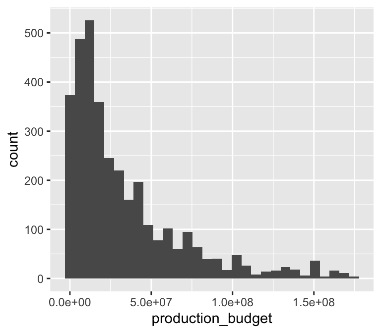
Now ggplot knows what to plot, but it doesn’t know how to plot it yet. Let’s add a new layer that creates a histogram with geom_histogram().
- This is a new layer! We add layers using the
+operator.
Customizing shapes
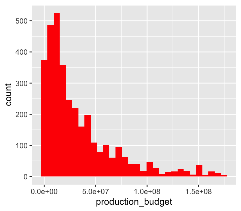
We can customize the shape within geom_histogram():
Adding label and titles
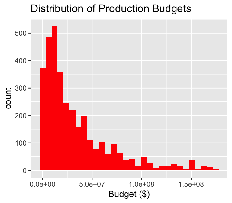
We can finally add axis labels and a title using the + operator:
Subsetting our data
Recall we can subset our data using the dplyr::filter() function from tidyverse. Note the use of the %in% operator here:
# remember you may need to run library(tidyverse)
select_genres <- c("Action", "Comedy")
# require county to be in SF Bay Area
action_comedy <- movies |>
  filter(genre %in% select_genres)
head(action_comedy)
# A tibble: 6 × 9
...1 release_date movie production_budget domestic_gross worldwide_gross
<dbl> <chr> <chr> <dbl> <dbl> <dbl>
1 1 6/22/2007 Evan Almi… 175000000 100289690 174131329
2 2 7/28/1995 Waterworld 175000000 88246220 264246220
3 4 12/25/2013 47 Ronin 175000000 38362475 151716815
4 5 6/22/2018 Jurassic … 170000000 416769345 1304866322
5 6 8/1/2014 Guardians… 170000000 333172112 771051335
6 7 5/7/2010 Iron Man 2 170000000 312433331 621156389
# ℹ 3 more variables: distributor <chr>, mpaa_rating <chr>, genre <chr>Scatter plots with ggplot2
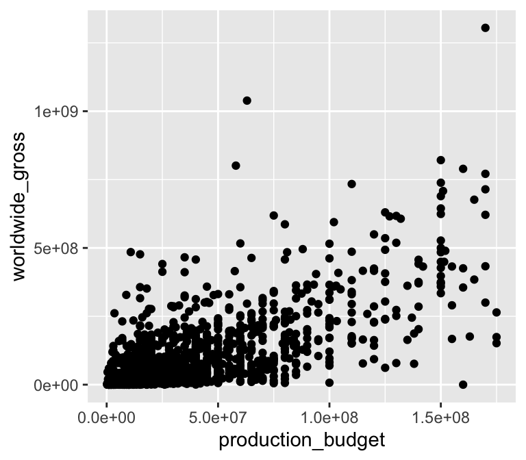
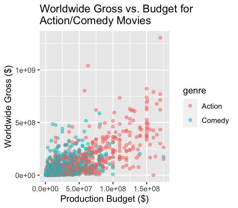
We can easily add another variable/aesthetic pair and change the shape to get a multivariate visualization:
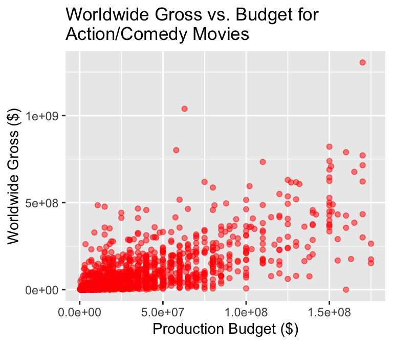
Customizing our scatter plot
We can similarly customize our scatter plots
Beyond two dimensions
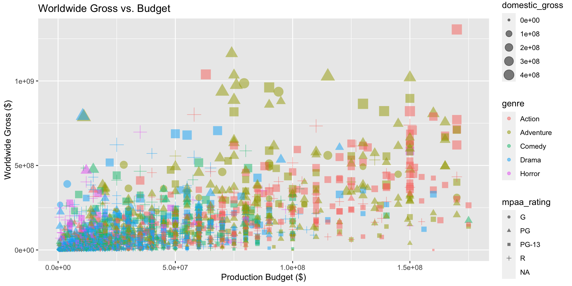
We can add even more mappings between aesthetics and variables to explore multivariate relationships:
What to remember for ggplot2
The ggplot2 package is built around a “grammar of graphics”: a standard way of building plots layer by layer.
The three basic layers:
- Data: a data frame with all of the variables of interest
- Aesthetics: graphical dimensions like
x,y,color,shape, and more. - Geometries: the specific markings used to illustrate your variables and aesthetics.
What to remember for ggplot2
Writing ggplot2 code can be confusing since most people are used to thinking about the geometry first.
One approach that may help:
- Start by picking a geometry (ex.
geom_point()). - Research the available aesthetics for that geometry (ex.
x,y,color,shape,size). Not all aesthetics are available for all geometries. - Map variables to the dataset to the relevant aesthetics.
Beyond two dimensions
Be sure to avoid making your visualization overly complicated:
Beyond two dimensions
ggplot cheatsheet
- Axes:
xlim(),ylim() - Legends: within initial
aes(), edit withintheme()orguides() geom_point(),geom_line(),geom_histogram(),geom_bar(),geom_boxplot(),geom_text()facet_grid(),facet_wrap()for facetinglabs()for labelstheme_bw()to make things look nicer- Graphical parameters:
colorfor color,alphafor opacity,lwd/sizefor thickness,shapefor shape,fillfor interior color, …
Find more tips here!
General principles for data visualization
Avoid:
- 3D plots
- Deceptive axes
- Excessive labels
- Excessive/bad coloring
- Fancy shading/effects
- Bad variable/axis names
- Unreadable labels
- Overloaded with information
Strive for:
- Simple, clean graphics
- Neat and human readable text
- Appropriate data range (bar charts should always start from 0!)
- Consistent intervals
- Roughly ~6 colors or less
- Size figures appropriately
Sometimes breaking the rules is okay…

Charles Minard
Sometimes breaking the rules is okay…
:focal(1223x1116:1224x1117)/https://tf-cmsv2-smithsonianmag-media.s3.amazonaws.com/filer/3b/22/3b22a3d0-0a6f-42fb-a1d6-58019a3d9312/11_33873a_city_and_rural_population_18901.png)
W.E.B. DuBois
Sometimes breaking the rules is okay…

Florence Nightingale
Lab 04
In this lab, we’ll practice data visualization with base R and ggplot2.
Some misleading visualizations
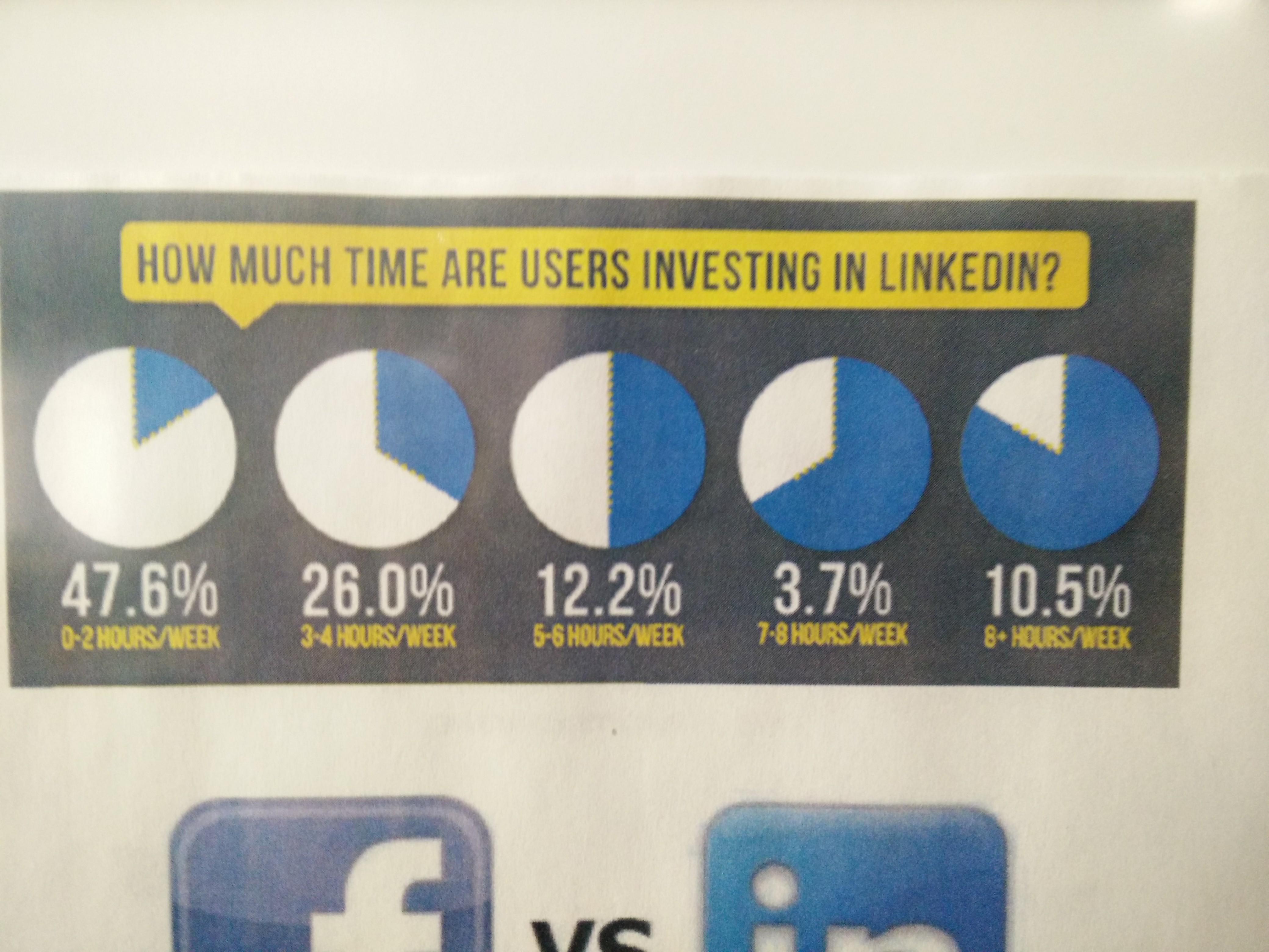
Avoid: Pie charts? The proportions are completely off.
Some misleading visualizations

Avoid: Pie charts? Percentages don’t add up.
Some misleading visualizations
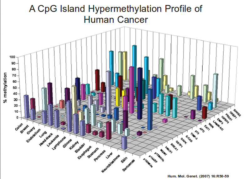
Avoid: 3d bar charts?!
Some misleading visualizations
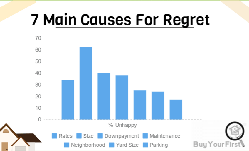
Avoid: Bad use of color
Some misleading visualizations
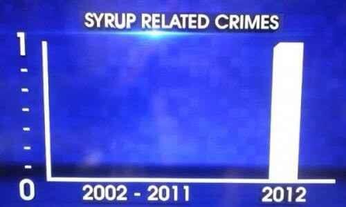
Avoid: Bad axis, lack of information, 3D bar chart
Some misleading visualizations
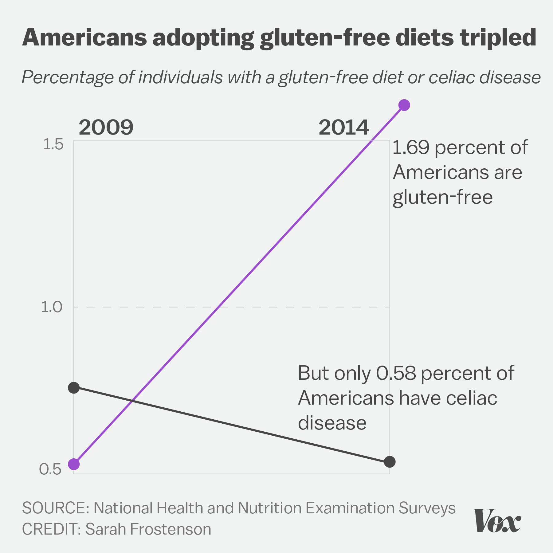
Avoid: Four numbers displayed as a cluttered chart, terrible labels, bad axis range
Some misleading visualizations
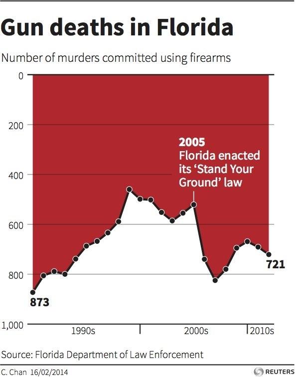
Avoid: Deceptively flipped y-axis! (and excessive color)
Some misleading visualizations
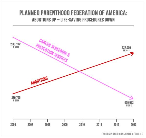
Avoid: Two axes in a single plot, bad axis range
Some misleading visualizations
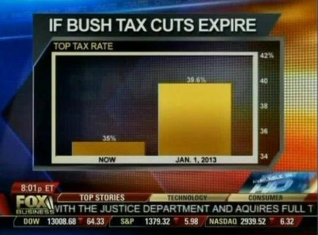
Avoid: Deceptive axis range (should start at 0)
Some misleading visualizations
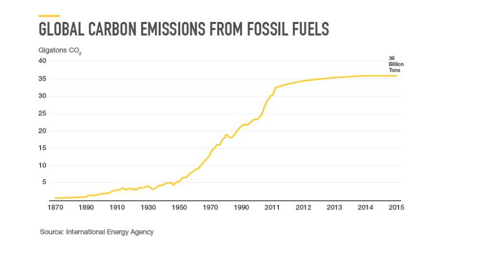
Avoid: Inconsistent x-axis intervals

