MATH167R: Data visualization
Warm-up
What does the following code do?
Warm-up
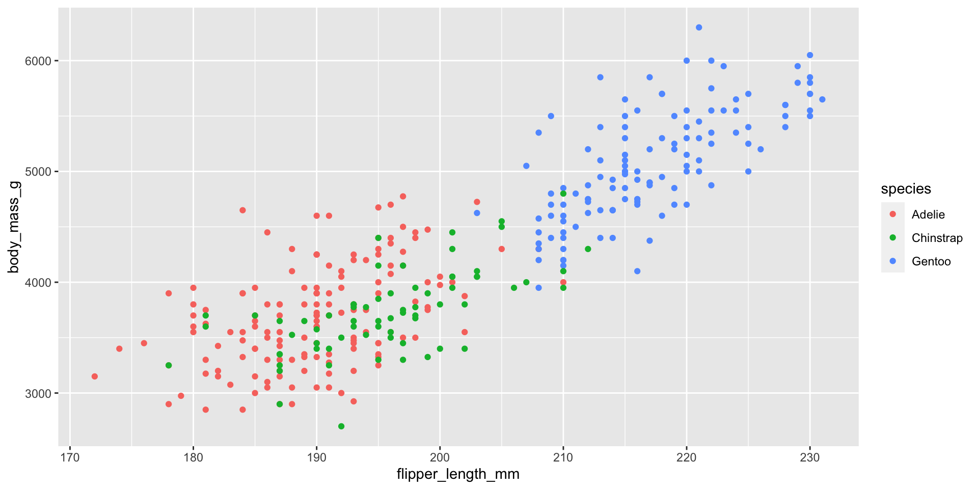
Overview of today
- Reviewing
ggplot2 - Advanced data visualization
- Styling R visualizations
Review: grammar of graphics
The three basic layers:
- Data: a data frame with all of the variables of interest
- Aesthetics: graphical dimensions like
x,y,color,shape, and more. - Geometries: the specific markings used to illustrate your variables and aesthetics.
Review: Cats and Dogs
Suppose we have the following data on animal weights. How can we compute the average weights of cats and dogs? [example from Andrew Heiss]
# A tibble: 10 × 2
   animal weight
   <chr>   <dbl>
 1 Cat      18.1
 2 Dog      37.9
 3 Cat      24.2
 4 Dog      58.8
 5 Dog      51.7
 6 Dog      38.5
 7 Cat      22.2
 8 Dog      27.8
 9 Cat      17.4
10 Cat      24.3
Code for generating data
library(tidyverse)
# example from Andrew Heiss
set.seed(12)
animals <- tibble(animal = c(rep(c("Small cat", "Big cat"), each = 250), rep("Dog", 500))) |>
  mutate(weight = case_when(
    animal == "Small cat" ~ rnorm(n(), 20, 5),
    animal == "Big cat" ~ rnorm(n(), 60, 5),
    animal == "Dog" ~ rnorm(n(), 40, 10)
  )) |>
  mutate(animal = ifelse(str_detect(animal, "cat"), "Cat", "Dog"))
Review: Cats and Dogs
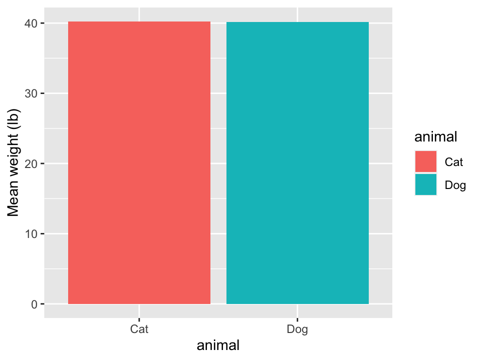
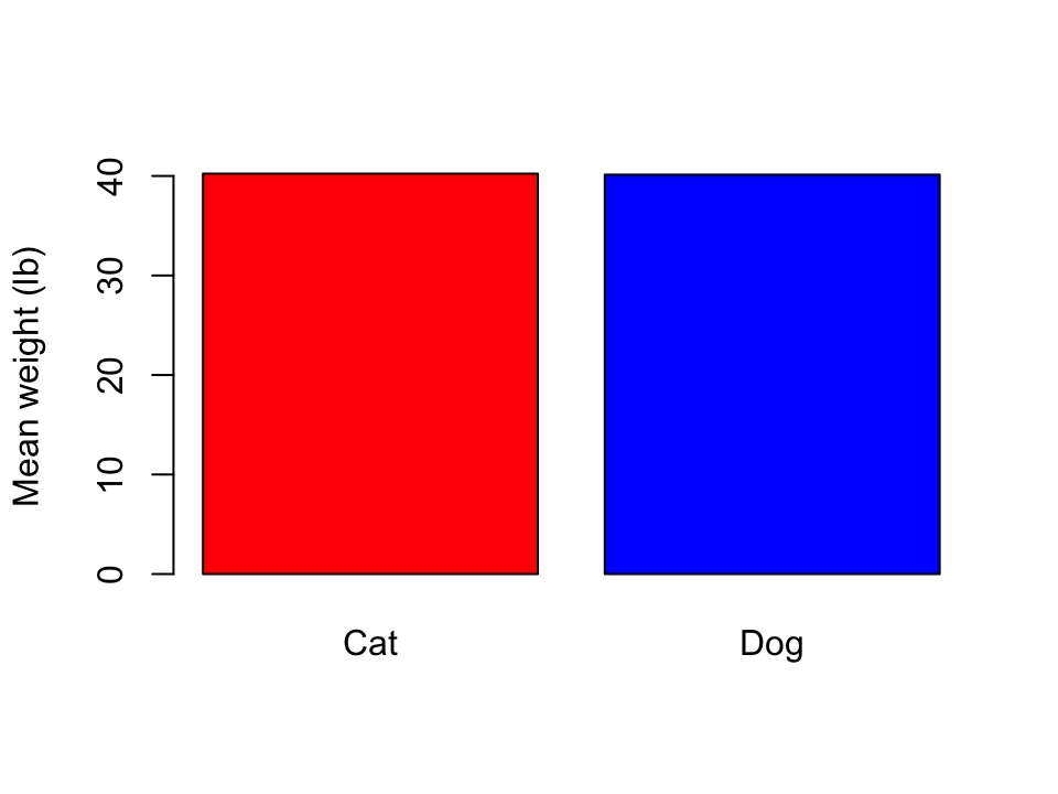
# A tibble: 2 × 2
  animal mean_wt
  <chr>    <dbl>
1 Cat       40.2
2 Dog       40.1
How can we turn this into a visual?
Review: Cats and Dogs
In ggplot2, there are two geometries for bar plots: geom_col() and geom_bar().
- The height of the bars of
geom_col()represent numerical values in each group. - The height of the bars of
geom_bar()represent the number of rows for each group.
Review: Cats and Dogs
Review: Cats and Dogs
If possible, show the data
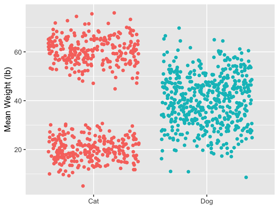
If possible, show the data
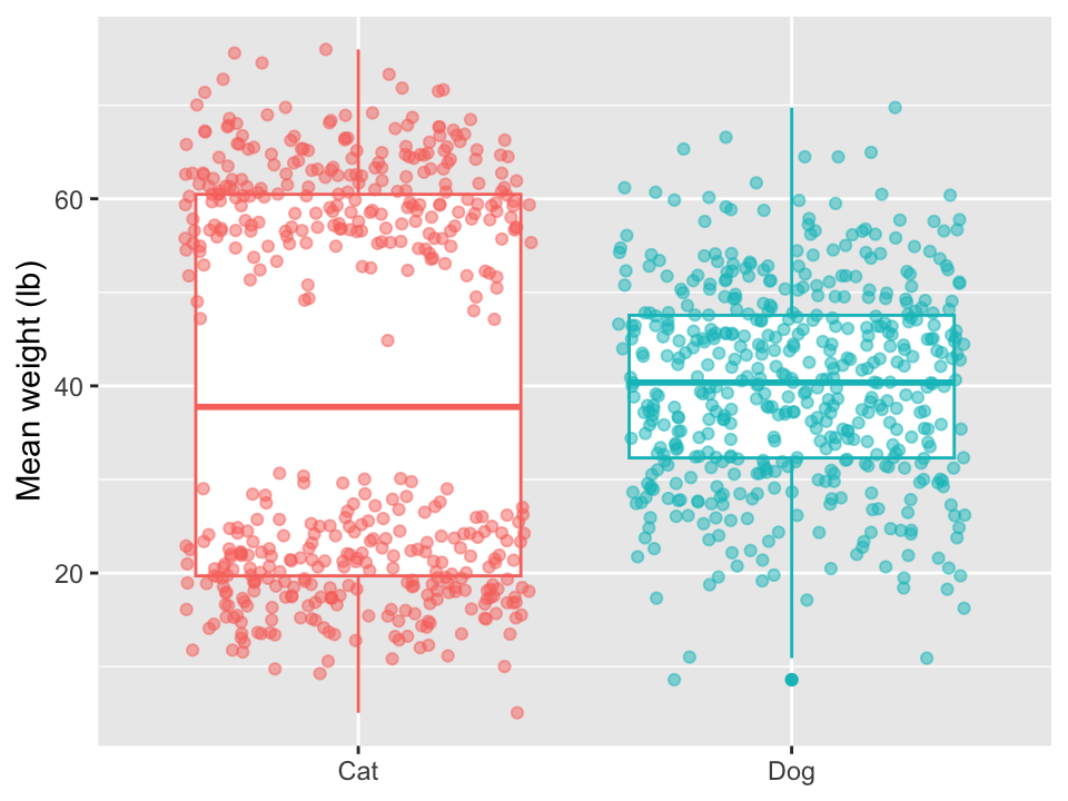
Review: Cats and Dogs
Takeaways:
- Data has to be in the right format to work with
ggplot2 - Geometries can be combined for more complex visualizations
- Only showing summary statistics can be misleading and can hide information.
Gapminder data

Gapminder data
- What changes do we see over time? What do we notice in this visualization?
- What questions arise? Do you have any doubts about this visualization?
Gapminder data
# A tibble: 6 × 6
  country     continent  year lifeExp      pop gdpPercap
  <fct>       <fct>     <int>   <dbl>    <int>     <dbl>
1 Afghanistan Asia       1952    28.8  8425333      779.
2 Afghanistan Asia       1957    30.3  9240934      821.
3 Afghanistan Asia       1962    32.0 10267083      853.
4 Afghanistan Asia       1967    34.0 11537966      836.
5 Afghanistan Asia       1972    36.1 13079460      740.
6 Afghanistan Asia       1977    38.4 14880372      786.
Gapminder data
        country        continent        year         lifeExp
 Afghanistan:  12   Africa  :624   Min.   :1952   Min.   :23.60
 Albania    :  12   Americas:300   1st Qu.:1966   1st Qu.:48.20
 Algeria    :  12   Asia    :396   Median :1980   Median :60.71
 Angola     :  12   Europe  :360   Mean   :1980   Mean   :59.47
 Argentina  :  12   Oceania : 24   3rd Qu.:1993   3rd Qu.:70.85
 Australia  :  12                  Max.   :2007   Max.   :82.60
 (Other)    :1632
      pop              gdpPercap
 Min.   :6.001e+04   Min.   :   241.2
 1st Qu.:2.794e+06   1st Qu.:  1202.1
 Median :7.024e+06   Median :  3531.8
 Mean   :2.960e+07   Mean   :  7215.3
 3rd Qu.:1.959e+07   3rd Qu.:  9325.5
 Max.   :1.319e+09   Max.   :113523.1
Gapminder data
Let’s work with the following data:
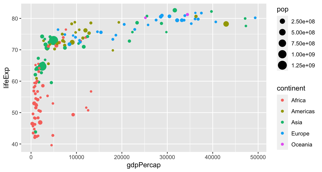
How do we recreate the following plot?

Gapminder data
Work with the people around you to recreate this plot:
Gapminder data
Hopefully, you produced something like this:
Playing with scales
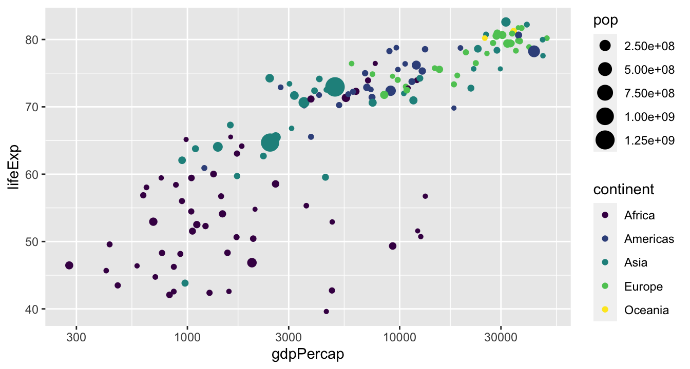
Scales are another layer we can add on top of our plot:
What do you expect the output to look like?
Playing with scales

Playing with scales
Small multiples
“At the heart of quantitative reasoning is a single question: Compared to what? Small multiple designs, multivariate and data bountiful, answer directly by visually enforcing comparisons of changes, of the differences among objects, of the scope of alternatives. For a wide range of problems in data presentation, small multiples are the best design solution.”
Edward Tufte
Small multiples
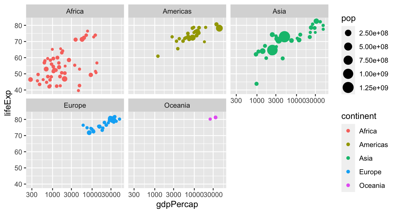
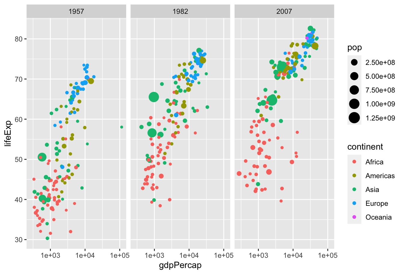
We can often make comparisons clearer by splitting a plot into many “small multiples” which have the same axes:
Facets for small multiples
Small multiples are implemented in ggplot2 via the facet_wrap() and facet_grid() functions:

Gapminder data
Work with the people around you to recreate this plot:
Themes
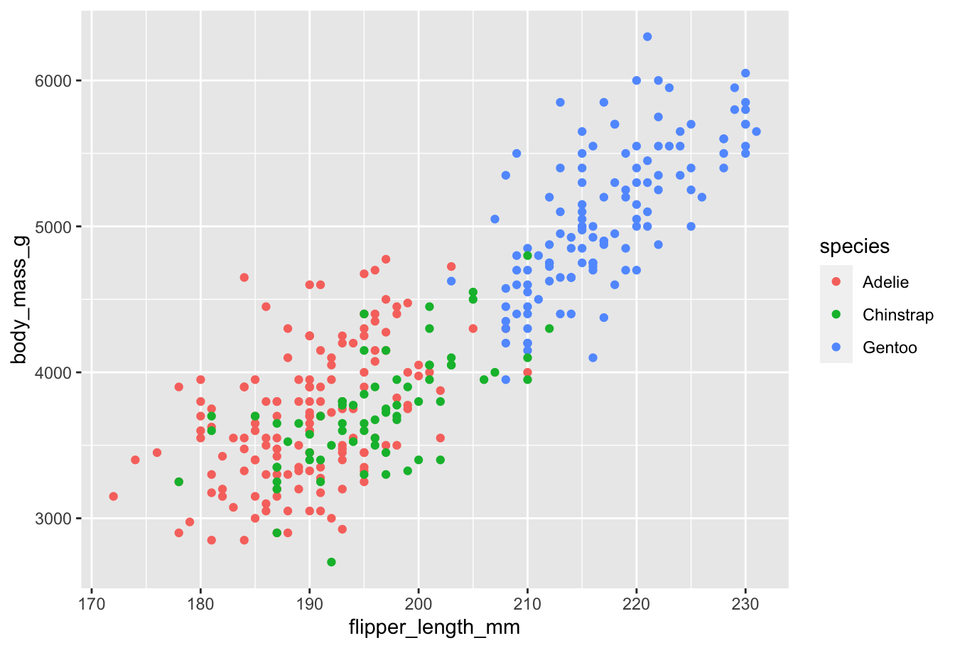
ggplot2 provides a default theme: gray background, basic discrete color scheme, etc.
Other themes
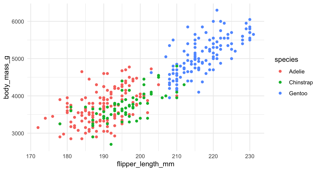
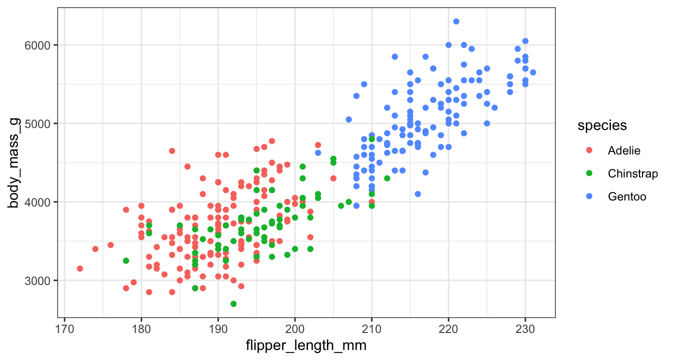
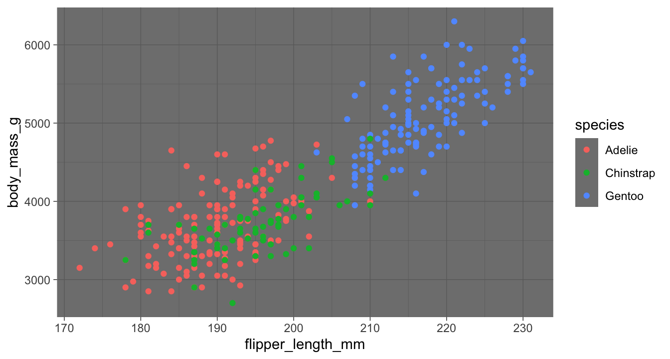
However, ggplot2 also comes with additional themes that you can layer on top of your plots:
Other themes
Other themes
Other themes
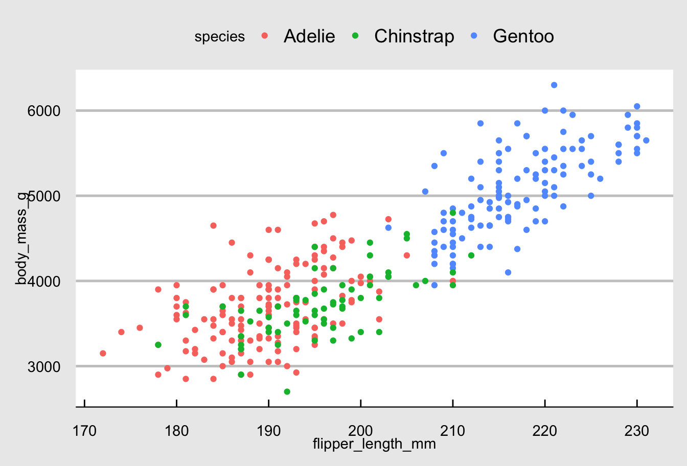
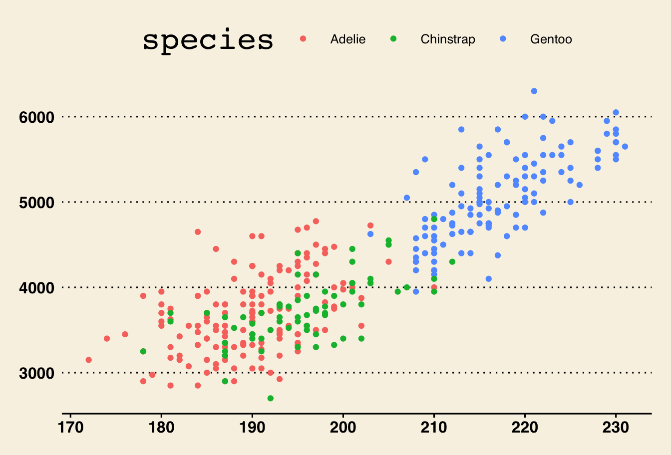
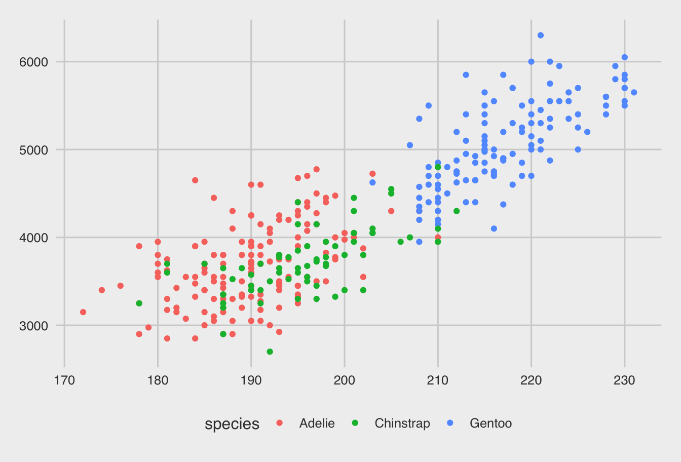
Other themes can be obtained from the ggthemes package:
Other themes
Other themes
Themes
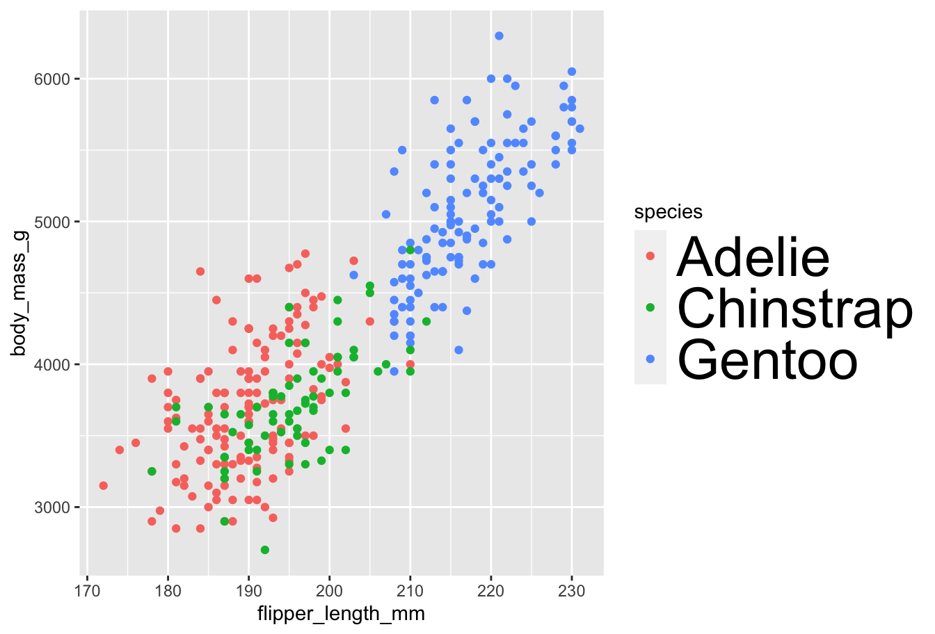
If you want finer control over your plot appearance, you can dive into the theme() function:
Themes
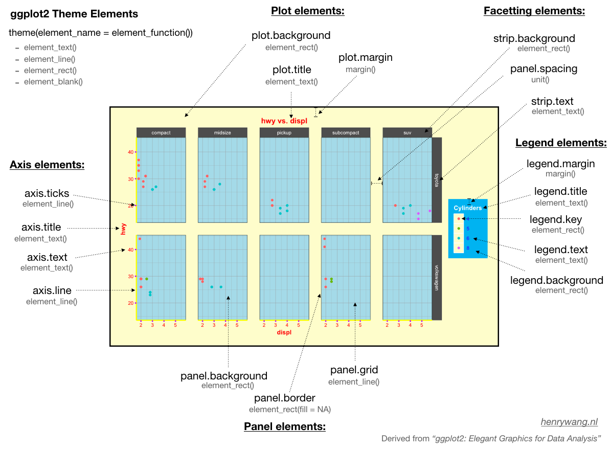
Within the theme function, we can manipulate various theme elements:
Themes
Other resources:
- Clara Granell’s ggplot2 Theme System Cheatsheet
- Andrew Heiss’s Ways to deal with long labels
- Chapter 8 of Kieran Healy’s Data Visualization
- How to create BBC style graphics